Energy, Direction and Design

XPF – The Expanded Form Band
Lab Work – XPF
XPF Band – Local VA, DC
First, there was a local band in and around DC, known as The Expanded Form (XPF). The band was in search of new artwork, new artwork, heavily influenced by the post-industrial era, grunge, and emo scenes. Additionally, they preferred playing at smaller venues, like small theaters and backyard shows, as opposed to stadium-sized venues. The band was based out of Northern Virginia and consisted of GWU students and more.
XPF

XPF LP

Marketing
Creative Direction
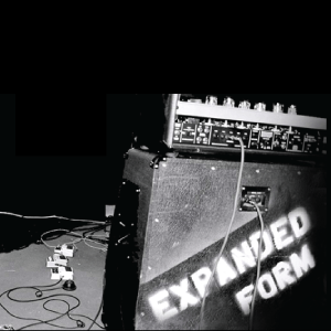
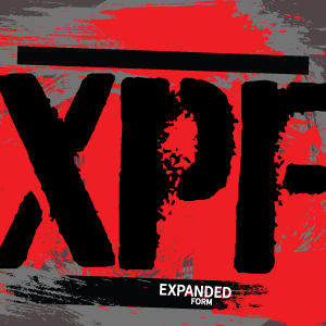
Next, let’s talk about the creative direction. The designs are emotional, meant to embody old world traveling bands that used to tour stadiums. The idea is to simply stencil equipment white spray paint. It’s simple, easy-to-do and easy to recognize on the road. Moreover, speakers and accessories show markings as to show ownership, as bands moved from one venue to another. The direction was grainy, diffused, and simple. The stenciled letters had fuzziness to them, clear but not clean-edged up close. It’s a metaphor perhaps, spray-painted, beat up, washed over and washed out. The second design shared has firetruck red backdrop, stage lighting, bleaching out the frame. This gives the illusion or the viewer the feeling of a first-person view, in the crowd under the limelight.
Heavily Processed, Over-processed; Energy
Lastly, we have the band actively playing, the piece is heavily ‘shopped’ with edits, pre-typography, in collage form. It’s a tritone creative piece serves as a poster or advertisement for show times and ticket sales. It mixes highlights and low light, an over-processed concept featuring white and blue (almost electric blue). Ultimately, the image was created to mimic or capture the stage energy, the raw power behind the music and cohesive sound.
Learn More About Specific Design Solutions
See other examples of our work, including web, design, brand and more